
The PRR Smartwagons is a national project in Portugal aimed at creating intelligent wagons. With cutting-edge technology, these wagons are capable of monitoring and controlling various aspects of the transported cargo, such as temperature and humidity, ensuring the safety and quality of the products. In addition, Smartwagons also have advanced communication systems, allowing for more efficient and secure management of rail transport.
 |  |
|---|---|
 |  |

The creation of the visual identity for the PRR Construir Material Circulante em Portugal, also known as "The Portuguese train" represents a foundational step in defining the future of this ambitious project. As a concept still in development, this initial identity serves as a projection of what the project aims to embody: a modern, dynamic, and distinctly Portuguese approach to rail transport. While the visual identity will soon undergo a transformation to align with the project's evolving vision, this early branding effort has laid the groundwork for what is to come, capturing the essence of innovation and national pride that will continue to define "O Comboio Português" as it progresses.
 |  |
|---|---|
 |  |

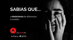
GET OFF ME is a project to raise awareness of sexual harassment, which has addressed several problems in Portugal generated by the sexualization of women.
Being an initiative created by the Faculty of Architecture of the University of Lisbon and a project guided by Designer Miguel Aboim, this project began as a basis for choosing one of the UN's objectives. The team involved focused on gender equality and funneled this topic into sexual harassment directed at any sex (female/male/other).
The entire project image was created from scratch. The logo, colors and typography were studied in depth to result in an aggressive but important image, showing the stronger and independent side of the victim, instead of the most vulnerable.Various aspects of communication were developed, such as posters, leaflets, presentations, advertising on social networks, audiovisuals, as well as a security sharing app.
 |  |
|---|---|
 |  |
 |

GET OFF ME

SOCIAL MEDIA CONTENT
Over the past five years, I have developed the visual identity of several brands, either building them from the ground up or expanding existing logotypes into cohesive communication and visual design strategies that make them dynamic and engaging.
My work spans a diverse range of projects from initiatives promoting gender equality, such as HeForShe, to creative ventures like Paradigma, a music-focused project, as well as institutional clients like Clínica Jardim das Amoreiras. I have also contributed professionally within the Portuguese railway sector, where I was responsible for creating social media content through design, video, and photography.
Across all these contexts, my approach focuses on crafting meaningful visual narratives that strengthen brand presence and foster authentic connections with audiences.
 |  |
|---|---|
 |  |

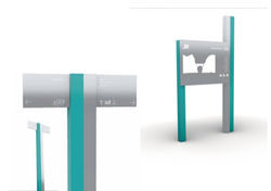
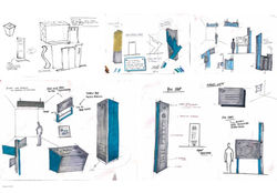
FOLLOW THE SEA
Have you ever thought how, through Design, you can mark and organize spaces, institutions or even cities?
Through Wayfinding and signage, the Follow The Sea project was created, in order to bring more life to the city of Lagos, Portugal.
Lagos, was the city chosen to develop an entire Wayfinding and signage project. A challenge launched by the graphic department of the Faculty of Architecture of the University of Lisbon, led to the final result of a collection linked to the sea.
Based on discoveries, Follow the sea is based on giving users the opportunity to follow the sea through signs. With a platinum material representing the fish, we accompany all the signaling tokens through the blue color that runs through the city connected by lines that guide you to discover it in a playful and lively way.
 |  |
|---|---|
 |  |
 |  |
 |  |

BOOK COVERS
The projection of book covers or various types of posters is a great challenge for Graphic and Communication Designers, due to the complexity involved in being innovative and impacting the public through the image. The collection presented below was designed with this ambition in mind.
The book cover project, launched by the Faculty of Architecture of the University of Lisbon and guided by Graphic Designer Elisabete Rolo, was a challenge that led each individual to think about how they could make a difference through image, typography and general environment, taking into account the chosen story.
Within the scope of what was described, three classics of literature were chosen: The Metamorphosis, Essay on Blindness and The Farm of Animals.
Through my interest in photography, I tried to explore the more artistic side of myself as a designer and through that explore strong typography that goes hand in hand with the style of photo editing. The result of the three layers is shown on the right.
 |  |
|---|---|
 |  |
 |

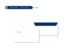
Following an in-depth study of brands and the importance of building them intelligently in terms of marketing, this led to the rebranding of Fábrica do Azulejo. A company located in Lisbon, Portugal.
The Rebranding of the company Fábrica do Azulejo, was a project guided by Designer Elisabete Rolo, with the aim of making the entire brand image more appealing and, above all, correct in terms of communication rules. The study was applied from colors, typography, logo projection, applications such as envelopes and trimmed papers, as well as other products such as packaging and sale bags.
The project was studied in depth, with several conceptualization and brainstorming booklets. The link below provides the standards manual for the final brand developed.
 |  |
|---|---|
 |  |
 |  |

CASE STUDY
I have a strong interest in photography, which I’ve explored extensively over time. More recently, my focus has shifted towards social and intercultural perspectives. My work is closely connected to proximity and to the relationship between human beings and their surroundings.
In this link below, a complete case study was carried out on the history of Schiphol Airport in Amsterdam and the success of Paul Mijksenaar as a Wayfinding Designer present throughout the airport.
The history, evolution both in terms of structure and Design, pictograms, colors, typography and the current work of the same Designer in the constant evolution of this space were studied.
 |  |
|---|---|
 |  |